.jpg) |
| This is from the album Stormwatch by Jethro Tull. I like the art style of it but also find the use of binoculars quite interesting, as though implying the storm being watched is the audience, As the lead singer is staring into the storm which is directly where the audience would view the piece from. |

I like the way the above cover by the Who mix's a vibrant graphic style whilst
maintaining the reality of photography. I think it is a strong effect and feels very
reminiscent and stereotypical of the hippies, 60's vibrant and extravagant themes.

DJ BEEZ November Mix Cd

This Cd comes from the Australian formed alternative metal band Karnivool
you will not see me"
The Cd cover appears to be an Eye, which is being affected by music, demonstrated through the swirly lines which are akin to that of electricity/vibrations. This is a visual metaphor to describe how the intensity of the music will wake "YOU" up. The artists are attempting to convey a message, possibly a hope of change. The front cover of their album art I think is therefore appropriate.
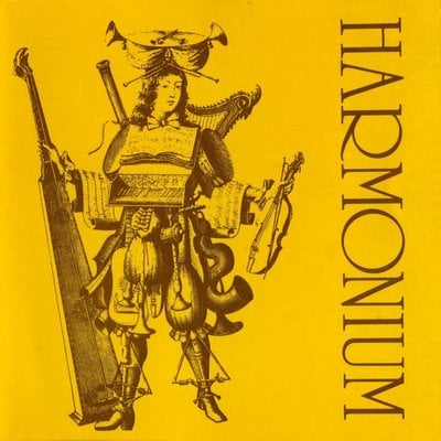
Harmonium is the first album by the folk rock band by the same name. The band originates from Quebec . Their first album was released in the mid seventies (1974)
The cover depicts a rather flamboyant appearing minstrel, thus representing the style of music in question. Though it is a rather simple album cover I think that the sketched drawing fits the plain yellow background as it gives it an illusion of age, as though the album has some history/myth behind it. The way that only one person displays what the entire band has created (that person most likely fictitious) gives a sense of unity, and the many instruments the figure holds would make it appear as though it is a one man band, or a band which comes together as one.

Santana is a band dating back to the sixites, with instrumental song, "Soul Sacrifice" being fondoly remembered from Woodstock festival many years on.
The above album art taken from their 1999 album Supernatural is a mix of various music styles, most specifically latin/rock. Its a collaboration of artists from Santana to Eric Clapton working in harmony. The album creates this theme of collaboration by the form of its art style, a collage of different musical instruments artistically sown together through a thread of myths and legends such as the centre piece being that of a Mermaid!
I think this is a very interesting album cover and it caught my eye straight away, which lead me to begin listening to the music, which in turn interests me to the artists other work. Therefore i'd say this is a successful album cover and something to bare in mind when creating my own cover.
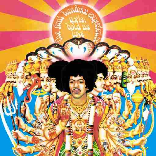
The second major studio album released by The Jimmy Hendrix experience, Axis as bold as love was released in 1967. Interesting interpretations of the song on the album entitled, "bold as love" give an insight into the bizarre yet complex and expressive front cover. Two things to note, Jimmy couldn't apparently read music and so expressed in color, this presumably meant most of his lyrics were made on the spot. I think the album art represents this style of music, i mean the lyrics clearly show this in-depth euphemism type meaning,

Blasphemophagher “The III Command of the Absolute Chaos" caught my eye by the sheer devastation represented in the artwork. The newly released album as of 31st of October 2011 is more than in keeping with its track listing, songs ranging from "Chaostorm of Atomization" to "Primordial Desolation". I think the black hole in the centre of the album cover artwork is not only in keeping with the musical work, but states a very important message.
In a time when Nuclear War seems about to boil, political messages through art might be the only way to warn of true devastation. While my video isn't on post destruction, I think this concept of visual obliteration could be incorporated to a degree, perhaps the cd art itself could be influenced from this design, images or a scene bursting out from the centre, in a reverse of destruction.
- Your CD/Digipak should consist of either 4,6 or 8 panels.
- It should reflect/ promote the artists/ music's image and create Synergy with; and reflect the style of your Video and AD. Needs to be similar, not necessarily the same.
- It should also relate to the artist/ type of music and the target audience.
- Before creating your cover/ Digipak you should analyse existing covers. Anaylses atleast two different type of covers for instance artistic or photographic, but include lots of example of the two or more cover style you choose to analyse.
In analyzing Covers you should examine the following:
- Design; layout, color, typography, style.
- Genre; Artist/Music, how does it relate? What does it tell us about them!
- Conventions?
- Audience; who? How do you know? How does it appeal/relate to that audience?
- How does it reflect/promote the image of the artist?
- What messages does it give about the artist? Music?
- What standardized conventions are there?
- How does it relate to other products (in the package)?
Analyzing Adverts:
- What is being advertised?
- Who is Ad targeting?
- How?How are artist and music being represented?
- Are any stereotypes or conventions being used?
- What message/s is it giving to the audience?
You should analyse the following:
- Design; layout, color, text, design, style.
- Function, inform/ persuade/ promote/ sell. How does it do it?
- Conventions; Song/ album title, artist, visual link to video, intertextuality, reviews, information on content, release date, where available, record label logo, website address.
- What is it telling us about the artist? Music? Etc.
- How does it link to the product it promoting? (how does yours link to your video/ cover)